Canola Council of Canada
Website Redesign and Integration
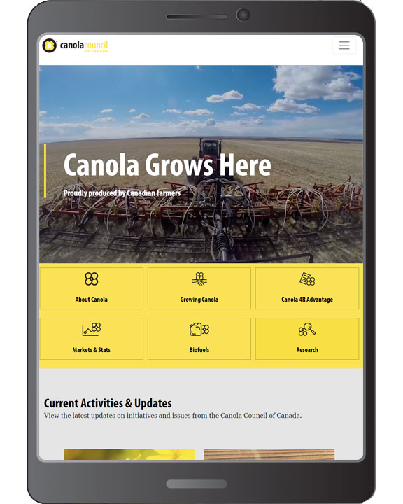
The Canola Council of Canada (CCC) wanted to modernize the user interface and experience of a key piece of the organization’s communications toolkit – their website canolacouncil.org. The original website was dated in its visual aesthetics and failed to adhere to modern web standards and design conventions. A lack of imagery, tiny font size, and busy visuals contributed to a dated look.
01
The Strategy
An extensive audit of the website was conducted, along with interviews with stakeholders to assess what was and wasn’t working. The result was a report with key recommendations to be incorporated into the new site. The project team then worked with the CCC to hone the recommendations and upon final agreement the UI/UX, content and technical build was started.
The site was redesigned from the ground up with a focus on a user interface that would be a clean break from the website of the past. During the design process, considerations were made for a modern layout with a greater use of visuals built on a rationalized and reorganized information hierarchy.
The new site features a modern design with more visual elements to improve user experience, reorganized content to reduce complexity, a quicker and more intuitive navigation and an improved site search functionality that surfaces content based on a variety of weights, including topic, tags and keywords. Responsive web design was prioritized to ensure compatibility with all modern mobile devices, as were current web conventions and standards to ensure that it remained future-proof.
02
The Creative

03
Connection

2021 Best of CAMA winner – Website
“Congratulations on making one of the best and most useful sites on the web! Excellent design and content.”